
|
|
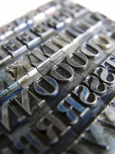
Recently a Facebook friend posted a video showing how a book is printed and bound using methods that go back to Gutenberg’s time: composing text with handset, movable type; laying out and locking up pages in lead; printing eight pages at a time with a flatbed hand press; and stitching, trimming, gluing, and binding a single-volume with a leather cover.1
This process—minus the leather cover and all the handwork—reminded me of my second job out of college, at Howell-North Books in Berkeley, California. Howell-North specialized in railroad histories, Western Americana and Californiana, and pretty much anything to do with steam power. Howell-North was unique in the publishing business, being one of three firms in North America at the time that typeset, laid out, printed, stored, and distributed their own books. They actually started as a commercial printer and moved into publishing when they were offered a book manuscript and decided to publish it themselves.
It was a treat for me, who always wanted to write books for a living, to work there as an editor. I got to see the process of taking words into finished volumes at every step. Of course, by the early 1970s, we didn’t use movable type, where every character and symbol is precast as a separate piece of lead. Instead, Howell-North set with Linotype® machines, which stored the letters and punctuation marks as individual hollow molds in a bank called a “matrix case”: one for uppercase, one for lower. As the typesetter composed each line of text—working from specifications for font, type size, leading, and line length provided by the book designer—the matrices would drop down in order into a small rack. The typesetter would check them visually, insert and activate letter and word spacers, and then cast the line in hot lead. Line after line would slide down into a galley tray, and at the end of the job the typesetter would pull a proof for me to read and compare with the marked-up manuscript.
After the galleys had been corrected, the typesetters pulled a clean set and sent them to the book designer, who cut the blocks of paper text apart and laid them out on page forms sized to the intended book’s dimensions and planned number of columns. The designer also placed and sized the photos that would accompany the text, figuring the percentage reduction—or less often, the blowup2—that would make the final image fit on the page. Then she gave the layout to me to write captions that would fit the space allowed. And finally she would spec my caption copy for font, leading, and length.
Once again the pressman would pull an impression of the galley trays, this time on good-quality paper with all the “type lice”—bits of dirt and metal—cleaned away. These page proofs would go to the photography department along with all the original photos. There the photographers would use a large-format camera to make one-to-one negatives of the page proofs and sized, screened negatives—that is, overlaid with a subtle dot pattern during reduction—of the photographs.3 The strippers would then position these various negatives into cutouts in large sheets of opaque red plastic—red because it blocks light just as effectively as black but allows the workers to see the edges of the negatives—according to the designer’s page layouts. They also added rules, page numbers, and headers and footers.
As in the video above, they would “strip in” usually eight pages for each side of a folio or “signature” sheet, making sixteen pages in all. After this complex folio was stripped, the photographers used a vacuum table to hold it against a large sheet of special photographic paper and used ultraviolet light to burn the image onto the paper. The result was a “blueline proof,” which showed the page images all in blue. Once again, I would proofread this blueline, not to look for typos or make changes in the text at this point, but to ensure all the text was in its proper place, photos were correctly sized and placed and not reversed or “flopped,” and the stripping was clean without gaps that would create unwanted lines and shadows.
When the bluelines had been corrected and approved, the burn-in was repeated, but this time on an aluminum sheet covered with lacquer. The ultraviolet light set and hardened the lacquer coating wherever the text, rules, and screened dots of images were shown on the page; the rest of the lacquer could then be wiped away with a solvent. This image in hard lacquer on bare metal was the page that would go to the printing press.4
Howell-North used big, sheet-fed Harris presses for their book work. These machines could print one color of ink on one side of the sixteen-page folio for a large-format book, or thirty-two pages in small format. A printing press like that is a mechanical marvel. A single motive source, the electric motor, sets everything in coordinated motion through a series of gears, chains, belts, and compressors: the pincers, blowers, and suction cups that separate and lift a single sheet of paper from the palletized stack; the multiple rollers that mix, thin, and spread the jellylike ink; the cylinder holding the lacquered aluminum plate, which has been bent end to end around it into a tube aligned with the movement of the sheet; the roller that wets the plate with water, which adheres to the bare aluminum and keeps it from taking up the oily ink; the roller that applies ink to the plate, where it sticks to the lacquered image; the cylinder holding a rubber sheet or “blanket” that takes ink from the plate and immediately transfers it to the paper—and hence “offsets” it, because the paper’s rough surface would otherwise wear away the lacquer on the plate in just a few passes; and the impression cylinder that presses the moving paper up against the blanket so that the paper takes a smooth image. Everything rolls, moves, shifts, and glides in synch, passing sheet after sheet through the press and stacking it in the take-up tray on the other side. I can watch the delicate, stately operation of a large sheet-feed press all day.
It’s a precision ballet of heavy metal pieces meeting and matching at tolerances far smaller than a millimeter. If the press couldn’t hold these tolerances, then laying down the different inks and varnishes required for four-color and high-gloss printing would be impossible, resulting in muddy images and misprints. Adjusting the plate and the blanket, running in the ink, and getting everything aligned and registered might take fifty, a hundred, or more sheets during “make ready,” before the pressman prints the first sheet in production.
Finally, the printed sheets go to the bindery for folding, trimming, stitching, and gluing. Most of these processes are now semi-automated—or were at Howell-North when I was there. The difference between modern binding and the handwork shown in the video above is the scale of the machinery. For example, trimming the pages no longer involves pulling a drawknife along the fore edge of a single book. Instead, a stack of paper twelve to eighteen inches thick is positioned in a hydraulic paper cutter that slices down with a guillotine blade that could easily cut a log in two—or remove the operator’s arm.5
Of course, most of even this modernized process is gone now. Linotype® machines and composing in hot metal are considered antiques, and sheet-fed presses laying down just one ink at a time have been replaced by multi-stand, web-fed presses that eat entire rolls of paper and print four colors and two varnishes in a single pass. Still, I’m honored to have worked in the last years of a process that goes back to Johannes Gutenberg.
Everything has become much faster, too. One of the Facebook respondents viewing the above video asked me how long it would take to print a book of 80,000 words using the old methods. My guess was that, if the book topped out at 300-plus pages, or about twenty folios, it would take one person a couple of weeks at minimum—and probably a couple of months, now that I think about it—to set the text, make up the page forms, print the folio pages on both sides, then fold, bind, trim, and cover the book. With printing techniques like those we had at Howell-North, it would take about the same amount of time, except that teams of people would be working in different departments and scheduling that one book project through the shop alongside a dozen others. Oh, and it would be a press run of 80,000 books, not just one.
I have seen two great changes in the bookmaking process over my years in the business. One is how type is assembled and pages are laid out. With the advent of small desktop computers—which were only a gleam in the eyes of Intel’s designers back in the early ’70s—we no longer have to rekeyboard a paper manuscript to set it in type. Page layout software like Corel’s Ventura Publisher® (on which I cut my teeth) or Adobe InDesign® (which I use now) take the word-processed document file as input and let you specify and lay out every part of the book on the screen. They can adjust their output as separate printer’s images, one layer for each color and varnish in the printing process; so that all the printer has to do is reproduce these files as big single negatives for burning the offset plates. This is manuscript to make ready in one step.
The other change involves the different formats used in web pages and epublishing. Because the page dimensions in a browser are no longer fixed—because the user can resize the window on the screen—and because most ereaders allow the user to change type size on the fly, a book designer for these media no longer thinks in terms of a foursquare page. Page designs now “hang” from the upper left-hand corner; the top and left margins are relatively fixed and immobile, while the right and bottom margins float, controlled only by parameters for buffering the text and images. The actual page layout and the reader’s final view depend on the window size and screen dimensions. And since everyone has different fonts associated with his or her browser and/or its underlying operating system, the designer must think in terms of generics like serif or san serif, bold or medium, and single- or double-spaced, rather than trying to specify Goudy Old Style 10/11 light Italic on a 12 pica line.
And finally, today with epublishing and print on demand (POD), all of the printer’s “make ready” process just goes away. After I’ve proofed my book manuscript, invited my beta readers’ comments, and made corrections, I take my final word-processed file in two different directions.
In one format, for ereaders, I use find-and-replace to turn all the manuscript’s type marks, punctuation, and symbols into HTML codes. Then I break the book into chapters and copy them into XHTML file forms that I’ve already worked up with a good cascading style sheet or “CSS.” It’s another step to create the various coordinating files used for conversion: these files put the book chapters and supporting materials in proper order and tell the ereader how to display them. Finally, I convert the file folder into an “epub” file that the reader can open directly with the right software and that Amazon’s Kindle, Barnes & Noble’s Nook, and Apple’s iBooks can convert for their own software and devices. In essence, I’m selling my text directly to the customer. Add a good cover image, enticing blurb, and metadata about the book, plus pricing decisions for the ebook distributor—and I’m in business. The entire book inventory is just a gigabyte or less on the distributor’s servers.
In the other format, I run the word-processed file through InDesign® using page settings I’ve worked up over the last couple of projects. I can alter type font, size, and other details easily on the fly. The software produces a PDF for the book text and cover that I send to my POD service provider to make into finished books by laser printing and perfect binding6—but only when the reader orders it. Again, add a blurb, some metadata, and pricing, and I’m in the bookmaking business with something the reader can actually hold in his or her hand, while the actual inventory held year-to-year is still less than a gigabyte of digital data.
Either process takes me a couple of days to a week of fairly focused work, and then the service—either the ebook distributor or the POD printer—requires a couple more days to check and proof my files upon receipt and flag any problems. Compared to Gutenberg, the process is practically instant and cost-free to me, except for an investment in some software and my own time and effort. All the rest is marketing, and that doesn’t change except for the book’s intended reader.7
1. The closest you can get to this process today is books from specialty printers like Andrew Hoyem’s Arion Press in San Francisco. This is bookmaking as fine art.
2. Generally, you get a better image if you reduce the original image in size rather than try to increase it. This originally had to do with reducing, rather than increasing, any minor imperfections in the original camera focus and with the grain size in photographic film—and nowadays the pixel dimensions in digital images.
3. The screen overlay renders the continuous shadings of the original photograph into a pattern of variously sized dots. If you tried to print from the gradations in a shaded area, the ink would simply adhere as one big blob and yield a black patch. The sized dots tick the eye into seeing shades of gray.
4. Howell-North also had an old flatbed press, which used page makeup in cast lead to print directly with type on paper, as in the video. Such a machine did away with all the camerawork, stripping, and bluelining but was even more time-consuming to set up and run—not to mention that the lead was heavy, the type was held in the page frames with a great deal of pressure, and dropping one of the forms practically guaranteed an explosion of type all over the shop. This press was an antique that was virtually abandoned in the shadowy recesses of Howell-North’s vast, shedlike building. I only saw it once, when Robert Howell and Morgan North uncovered it to show a guest, and I never saw it in operation. The last pages this press ever printed were still lying there on its bed in a ton of lead.
5. This equipment is so dangerous that, once the operator has positioned the stack within it, he or she must close a cage over the machine’s opening end and activate the cutter by pressing four switches—one for each hand and foot. Otherwise, carelessly reaching in at the last minute to make “one more little adjustment” would likely shear off a limb.
6. Perfect binding is a technique that grew up in the late ’60s, where instead of stitching the folios or signature sections together, they are glued to the spine of a paperback book with flexible adhesive. The process also works with single pages, but there the early examples tended to be delicate and had a distressing habit, when the reader flipped rapidly through the book, of shooting pages across the room. This led me, at the time, to coin the phrase “Perfect binding—isn’t.”
7. For more on this, see my series on the new world of publishing, including eBook Publishing: The Author’s Toolkit from September 18, 2011. And if you don’t think this blog is part of my marketing efforts, think again.